

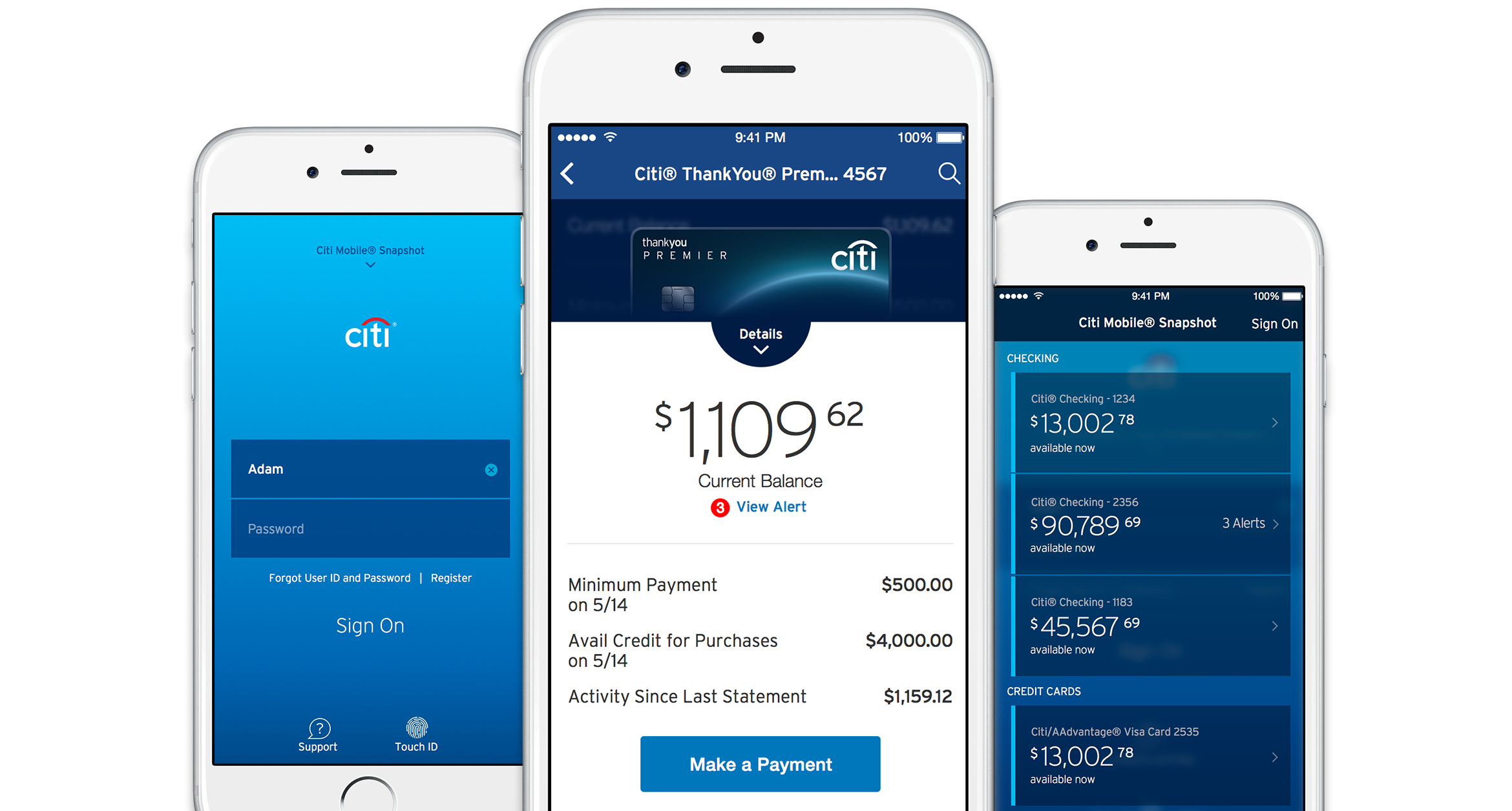
Citi Mobile iOS
My role as Group Creative Director: Managing a creative team in tight alignment with multiple clients, stakeholders, and technology partners to completely redesign and refactor Citi's iOS mobile app.

The Ask
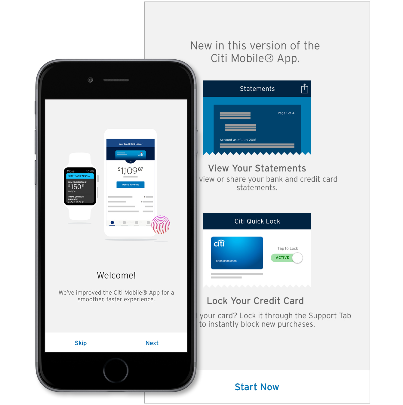
When Apple calls, you answer. When Apple asks if you want to be a featured partner for a major launch, you say yes. But when that means you need to remake your primary mobile application in four months, it's time to change the way you work.
For Citi, this meant calling in their specialists and getting serious about working in an agile way. Historically, Citi's mobile experience had been based on a phonegap architecture. When they wanted to both support the new Apple Watch and get public recognition from everyone's favorite fruit company, they knew that this meant they needed to take their iOS app from HTML in a native wrapper to a best-citizen native experience.
I was at this time assembling a creative team in New York focused on future-vision work with Citi. Happily diverting into this track, we helped Citi establish an Agile working core co-locating with IBM technology experts and Citi development teams and business owners.

Work fast. Do good.
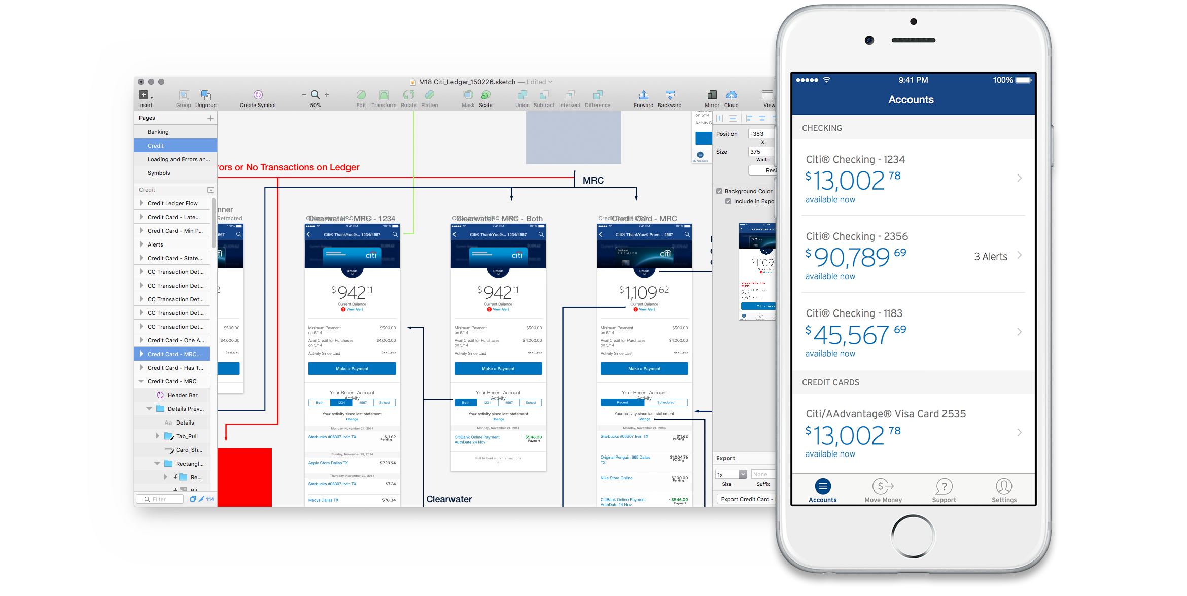
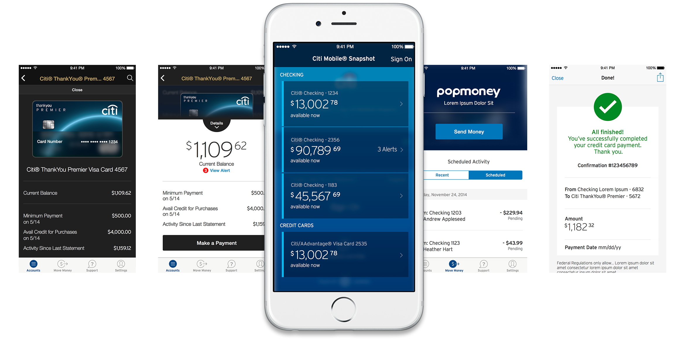
When you need to stand up a full-featured banking application in a few months while wrangling a technology base and business structures inherited from decades ago, it's important to make good use of what you already have. Our goal was to turn the interface of the app from something that was all-custom HTML into something that both was and felt truly native on an iPhone. We had to change a number of interactions, navigation structures, and features, while introducing as much delight as we could. None of these changes could happen, however, without a thorough understanding of how everything worked in the first place. This wasn't going to be an MVP launch — we needed a fully featured drop-in replacement for the existing app.
Into this high-pressure environment, we introduced many new ways of working, from the agile team structure to using Sketch files and short conversations instead of dozens of Photoshop files and hours of reviews. The entire team adapted to working in new ways, with new software, and even new platforms.
Clean and Push
The most interesting opportunity of the iOS app redesign was our ability to clear out years of haphazard decisions and design and consider the app holistically. Regular design reviews with Apple user experience evangelists helped us have guidance around just where we could push, and where Apple wanted us to hold to their own standards.
Our goal was to create an app that users didn't need to sit and figure out how to use. Weekly testing and biweekly internal business owner reviews meant that we had constant checks on problem areas and opportunities.
In the end, we were given the license to clean and refine Citi's own idea of itself, welcoming their users into a much easier, better way of banking. More than just one experience, the Citi Mobile app includes two tiers; a blue and white theme for most customers, and a gold and black one for those of the premier Citi Gold status.


The Result
An intense and rewarding experience, the native iOS project gave everyone involved new perspective, and new capabilities. Most important was the reaction of Citi's customers: Ratings of the Citi Mobile app on the App Store improved upon launch of the new app, vaulting from 2 stars to 5.